How to Set Up a Conservation Color-Matching Workstation
Environment Shapes Perception
A conservator's color-matching skill means nothing if their workstation introduces perceptual errors. The most experienced eye in the world will produce inconsistent results under inconsistent lighting, against colored backgrounds, or with poorly organized materials.
Setting up a proper color-matching workstation is one of the highest-return investments a conservation lab can make. It costs relatively little — mostly thoughtful arrangement rather than expensive equipment — and immediately improves accuracy and consistency across the entire team.
Lighting: The Single Most Important Factor
Lighting determines everything in color matching. The same pigment mixture looks completely different under warm tungsten, cool fluorescent, and calibrated daylight. If your lighting is wrong, your matches will be wrong — no matter how skilled you are.
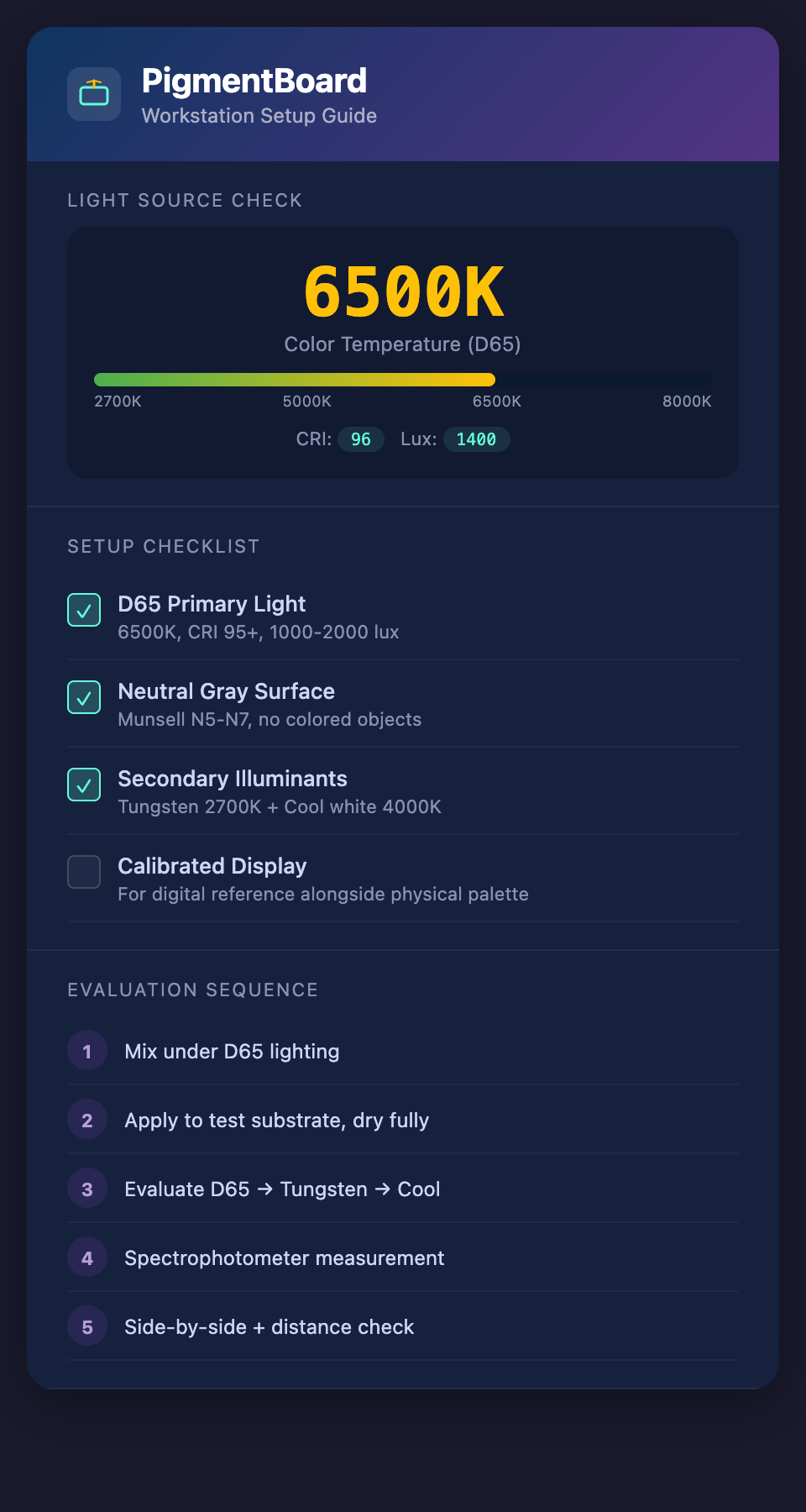
Primary light source requirements:
- Color temperature: 6500K (D65 standard) — This is the internationally recognized standard for color evaluation. It simulates average north-sky daylight and provides balanced energy across the visible spectrum.
- Color Rendering Index (CRI): 95+ — CRI measures how accurately a light source reveals the true colors of objects. Standard fluorescent tubes typically have CRI of 80-85, which is inadequate for color-critical work.
- Illumination level: 1000-2000 lux at the work surface — Enough to see subtle color differences without causing eye fatigue.
- Even distribution — No hot spots, shadows, or gradients across the work surface. Use diffused lighting or multiple light sources positioned to eliminate shadows.
Recommended light sources:
- D65 fluorescent tubes (e.g., Philips TL-D 90 De Luxe, GE Chroma 75)
- LED panels rated at 6500K with CRI 95+ (increasingly available and energy-efficient)
- Dedicated color assessment cabinets (e.g., VeriVide, X-Rite SpectraLight) for the most critical evaluations
Secondary light sources for metamerism checking:
- Tungsten or warm white (2700K) — simulates gallery and domestic lighting
- Cool white fluorescent (4000K) — simulates office and storage lighting
- A switchable multi-illuminant booth is ideal but not essential — separate desk lamps at different color temperatures work if positioned consistently
Neutral Surroundings
Your color perception is influenced by everything in your visual field, not just the object you are focusing on. Colored walls, clothing, equipment, and even the desktop surface affect your perception through simultaneous contrast.
Workstation surface: Neutral mid-gray (approximately Munsell N5 to N7). This is the most important single specification. Not white (too bright, causes eye fatigue and shifts perception of dark colors), not black (too dark, makes all colors appear lighter than they are). A gray card or gray-painted surface is ideal.
Surrounding walls: If possible, the wall behind and around the workstation should also be neutral gray. If painting walls is not an option, position the workstation so the conservator faces a neutral surface, not a colored wall, window, or busy display.
Clothing: This may seem excessive, but for critical color evaluation, wearing a white lab coat or neutral-colored clothing prevents colored reflections from affecting perception. A bright red sweater will cast a subtle warm glow on the work surface.
Remove colored objects from the immediate visual field — colored tool handles, brightly labeled supply containers, personal items.
Material Organization
A well-organized workstation reduces error and saves time:
Pigment arrangement:
- Store conservation pigments in a consistent order — by hue family (reds together, blues together, etc.)
- Label clearly with product name, code, supplier, and batch number
- Keep frequently used pigments within arm's reach; less common ones in a secondary storage area
- Dispose of or clearly mark pigments that are past their shelf life
Mixing surface:
- Use a white ceramic or glass palette — the neutral white allows you to see the true color of the mixture
- Clean the palette thoroughly between sessions (dried pigment residue shifts perception)
- Have multiple palette knives in different sizes, cleaned and ready
Test substrates:
- Keep a stock of prepared test cards or fabric swatches that match the substrate you will be applying to
- Pre-cut them to a standard size for consistent application
- Label each test application with the formula, date, and lighting conditions
Reference materials:
- Munsell color chart (or equivalent) accessible for quick comparison
- Spectrophotometer (if available) positioned for easy measurement without disrupting the mixing workflow
- Digital display calibrated for color accuracy (if using digital color reference tools)
The Evaluation Sequence
Establish a consistent sequence for evaluating color matches:
- Mix the formula on a clean palette under D65 lighting
- Apply to test substrate — using the same application method you will use on the textile
- Allow to dry completely — wet and dry color differ significantly. Use a hair dryer on low heat if time is limited, but always evaluate fully dry samples
- First evaluation under D65 — Does the dried sample match the target?
- Second evaluation under tungsten — Check for metamerism
- Third evaluation under cool white — Confirm across a third illuminant
- Spectrophotometer measurement — Record ΔE and full spectral data
- Side-by-side placement — Place the test substrate directly adjacent to the target area on the textile
- Distance check — Step back to normal viewing distance (3-5 feet) and evaluate
- Document — Record the formula, evaluation results, and any adjustments needed
Common Workstation Mistakes
Using a window as your light source. Natural daylight changes throughout the day — in color temperature, intensity, and spectral distribution. Morning light is completely different from afternoon light. A calibrated artificial D65 source is more consistent than any window.
Evaluating against a white background. White surroundings make colors appear darker and more saturated than they will look in the gallery environment.
Mixing and evaluating at the same time. Take a 30-second break between mixing and evaluation. Your eyes adapt to the colors on the palette, shifting your perception. Looking at the neutral gray work surface for half a minute resets your color adaptation.
Evaluating only dry-on-dry. If your repair will be applied over a preparation layer or toned ground, evaluate your test sample over the same ground — not against bare substrate.
Ignoring the drying shift. Many conservation pigments shift noticeably as they dry (especially those in aqueous binders). Always evaluate fully dry samples.
Budget Considerations
A full professional setup is ideal, but even limited budgets can achieve major improvements:
Essential (under $200):
- D65 fluorescent tubes or LED panel
- Neutral gray work surface (painted MDF or commercial gray cards)
- White ceramic mixing palette
- Consistent evaluation sequence (free — just discipline)
Improved (under $1,000):
- Multi-illuminant evaluation setup (D65 + tungsten desk lamp)
- Munsell color chart
- Organized pigment storage system
Professional (under $5,000):
- Color assessment cabinet with multiple illuminants
- Portable spectrophotometer
- Calibrated display for digital reference
The essential setup, properly implemented, eliminates most of the common perceptual errors that undermine color matching. You do not need the most expensive equipment to get dramatically better results.
Connecting the Physical and Digital Workflow
As digital degradation modeling tools become available, the workstation should accommodate both physical and digital evaluation:
- Position a calibrated display alongside the physical work surface
- Ensure the display is viewable under the same D65 lighting (not in a shadowed area where screen brightness dominates)
- Compare digital predictions to physical samples under consistent conditions
- Use the display for degradation modeling and the physical palette for mixing and verification
Ready to complement your optimized workstation with digital degradation modeling? Join the PigmentBoard waitlist.